Animating a map of Covid in the Northeast US
I recently put together a short animation showing the spread of Covid throughout the Northeast United States:
I thought it might be interesting to walk through the process I used to create the video. The steps described in this article aren’t exactly what I used (I was dealing with data in a PostGIS database, and in the interests of simplicity I wanted instructions that can be accomplished with just QGIS), but they end up in the same place.
Data sources#
Before creating the map, I had to find appropriate sources of data. I needed three key pieces of information:
- State and county outlines
- Information about population by county
- Information about Covid cases over time by county
US Census Data#
I was able to obtain much of the data from the US Census website, https://data.census.gov. Here I was able to find both tabular demographic data (population information) and geographic data (state and county cartographic borders):
This dataset contains population estimates by county from 2010 through 2019. This comes from the US Census “Population Estimates Program” (PEP).
This dataset contains US county outlines provided by the US Census.
This dataset contains US state outlines provided by the US Census.
The tabular data is provided in CSV (comma-separated value) format, which is a simple text-only format that can be read by a variety of software (including spreadsheet software such as Excel or Google Sheets).
The geographic data is available as both a shapefile and as a KML file. A shapefile is a relatively standard format for exchanging geographic data. You generally need some sort of GIS software in order to open and manipulate a shapefile (a topic that I will cover later on in this article). KML is another format for sharing geographic data that was developed by Google as part of Google Earth.
New York Times Covid Data#
The New York Times maintains a Covid dataset (because our government is both unable and unwilling to perform this basic public service) in CSV format that tracks Covid cases and deaths in the United States, broken down both by state and by county.
Software#
In order to build something like this map you need a Geographic Information System (GIS) software package. The 800 pound gorilla of GIS software is ArcGIS, a capable but pricey commercial package that may cost more than the casual GIS user is willing to pay. Fortunately, there are some free alternatives available.
Google’s Google Earth Pro has a different focus from most other GIS software (it is designed more for exploration/educational use than actual GIS work), but it is able to open and display a variety of GIS data formats, including the shapefiles used in this project.
QGIS is a highly capable open source GIS package, available for free for a variety of platforms including MacOS, Windows, and Linux. This is the software that I used to create the animated map, and the software we’ll be working with in the rest of this article.
Preparing the data#
Geographic filtering#
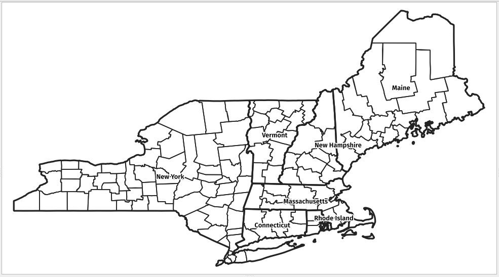
I was initially planning on creating a map for the entire United States, but I immediately ran into a problem: with over 3,200 counties in the US and upwards of 320 data points per county in the Covid dataset, that was going to result in over 1,000,000 geographic features. On my computer, QGIS wasn’t able to handle a dataset of that size. So the first step is limiting the data we’re manipulating to something smaller; I chose New York and New England.
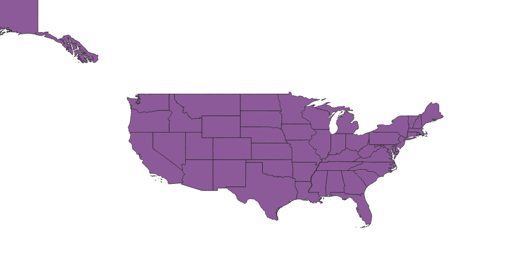
We start by adding the cb_2018_us_state_5m map to QGIS. This gives
us all 50 states (and a few territories):
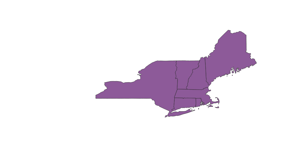
To limit this to our target geography, we can select “Filter…” from the layer context menu and apply the following filter:
"NAME" in (
  'New York',
  'Massachusetts',
  'Rhode Island',
  'Connecticut',
  'New Hampshire',
  'Vermont',
  'Maine'
)
This gives us:
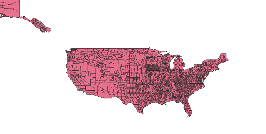
Next, we need to load in the county outlines that cover the same
geographic area. We start by adding the cb_2018_us_county_5m
dataset to QGIS, which gets us:
There are several ways we could limit the counties to just those in our target geography. One method is to use the “Clip…” feature in the “Vector->Geoprocessing Tools” menu. This allows to “clip” one vector layer (such as our county outlines) using another layer (our filtered state layer).
We select “Vector->Geoprocessing Tools->Clip…”, and then fill in in the resulting dialog as follows:
- For “Input layer”, select
cb_2018_us_county_5m. - For “Overlay layer”, select
cb_2018_us_state_5m.
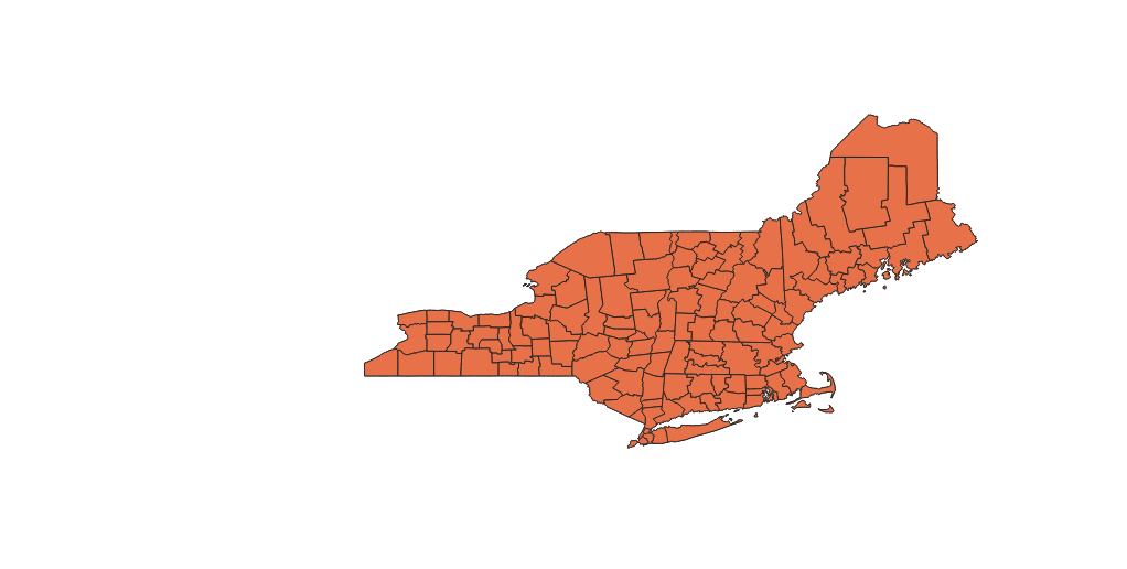
Now select the “Run” button. You should end up with a new layer named
Clipped. Hide the original cb_2018_us_county_5m layer, and rename
Clipped to cb_2018_us_county_5m_clipped. This gives us:
Instead of using the “Clip…” algorithm, we could have created a virtual layer and performed a spatial join between the state and county layers; unfortunately, due to issue #40503, it’s not possible to use virtual layers with this dataset (or really any dataset, if you have numeric data you care about).
Merging population data with our geographic data#
Add the population estimates to our project. Select “Layer->Add
Layer->Add Delimited Text Layer…”, find the
co-est2019-alldata.csv dataset and add it to the project. This layer
doesn’t have any geographic data of its own; we need to associate it
with one of our other layers in order to make use of it. We can this
by using a table join.
In order to perform a table join, we need a single field in each layer
that corresponds to a field value in the other layer. The counties
dataset has a GEOID field that combines the state and county FIPS
codes, but the population dataset has only individual state and
county codes. We can create a new virtual field in the population
layer that combines these two values in order to provide an
appropriate target field for the table join.
Open the attribute table for population layer, and click on the “Open
field calculator” button (it looks like an abacus). Enter geoid for
the field name, select the “Create virtual field” checkbox, and select
“Text (string)” for the field type. In the “Expression” field, enter:
lpad(to_string("STATE"), 2, '0') || lpad(to_string("COUNTY"), 3, '0')
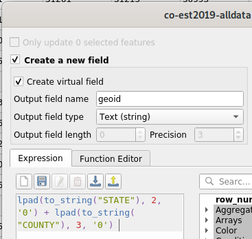
When you return the to attribute table, you will see a new geoid
field that contains our desired value. We can now perform the table
join.
Open the properties for the cb_2018_us_county_5m_clipped layer we
created earlier, and select the “Joins” tab. Click on the “+” button.
For “Join layer”, select co-est2019-alldata. Select geoid for
“Join field” and GEOID for target field. Lastly, select the “Custom
field name prefix” checkbox and enter pop_ in the field, then click
“OK”.
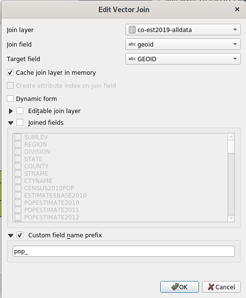
If you examine the attribute table for the layer, you will see the each county feature is now linked to the appropriate population data for that county.
Merging Covid data with our geographic data#
This is another table join operation, but the process is going to be a little different. The previous process assumes a 1-1 mapping between features in the layers being joined, but the Covid dataset has many data points for each county. We need a solution that will produce the desired 1-many mapping.
We can achieve this using the “Join attributes by field value” action in the “Processing” toolbox.
Start by adding the us-counties.csv file from the NYT covid dataset
to the project.
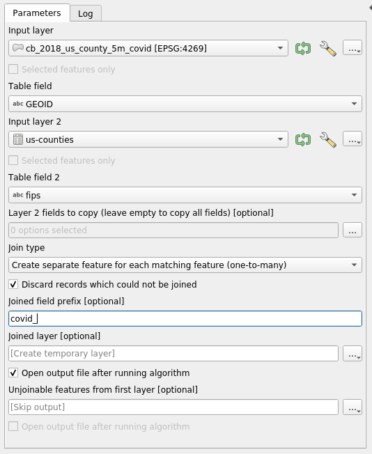
Select “Toolbox->Processing” to show the Processing toolbox, if it’s not already visible. In the “Search” field, enter “join”, and then look for “Join attributes by field value” in the “Vector general” section.
Double click on this to open the input dialog. For “Input layer”,
select cb_2018_us_county_5m_clipped, and “Table field” select
GEOID. For “Input layer 2”, select us-counties, and for “Table
field 2” select fips. In the “Join type” menu, select “Create
separate feature for each matching feature (one-to-many)”. Ensure the
“Discard records which could not be joined” is checked. Enter covid_
in the “Joined field prefix [optional]” field (this will cause the
fields in the resulting layer to have names like covid_date,
covid_cases, etc). Click the “Run” button to create the new layer.
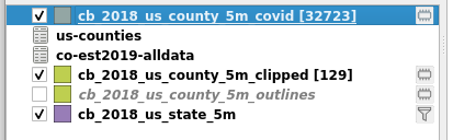
You will end up with a new layer named “Joined layer”. I suggest
renaming this to cb_2018_us_county_5m_covid. If you enable the “show
feature count” checkbox for your layers, you will see that while the
cb_2018_us_county_5m_clipped has 129 features, the new
cb_2018_us_county_5m_covid layer has over 32,000 features. That’s because
for each county, there are around 320 data points tracking Covid cases
(etc) over time.
Styling#
Creating outlines#
The only layer on our map that should have filled features will be the covid data layer. We want to configure our other layers to only display outlines.
First, arrange the layers in the following order (from top to bottom):
- cb_2018_us_state_5m
- cb_2018_us_county_5m_clipped
- cb_2018_us_county_5m_covid
The order of the csv layers doesn’t matter, and if you still have the
original cb_2018_us_county_5m layer in your project it should be
hidden.
Configure the state layer to display outlines. Right click on the layer and select “Properties”, then select the “Symbology” tab. Click on the “Simple Fill” item at the top, then in the “Symbol layer type” menu select “Simple Line”. Set the stroke width to 0.66mm.
As long as we’re here, let’s also enable labels for the state layer. Select the “Labels” tab, then set the menu at the top to “Single Labels”. Set the “Value” field to “Name”. Click the “Apply” button to show the labels on the map without closing the window; now adjust the font size (and click “Apply” again) until things look the way you want. To make the labels a bit easier to read, select the “Buffer” panel, and check the “Draw text buffer” checkbox.
Now do the same thing (except don’t enable labels) with the
cb_2018_us_county_5m_clipped layer, but set the stroke width to
0.46mm.
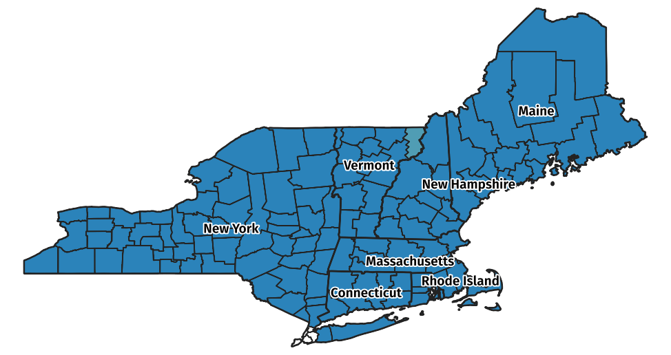
If you hide the the Covid layer, your map should look like this (don’t forget to unhide the Covid layer for the next step):
Creating graduated colors#
Open the properties for the cb_2018_us_county_5m_covid layer, and
select the “Symbology” tab. At the top of the symbology panel is a
menu currently set to “Single Symbol”. Set this to “Graduated”.
Open the expression editor for the “Value” field, and set it to:
(to_int("cases") / "pop_POPESTIMATE2019") * 1000000
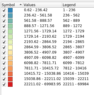
Set the “Color ramp” to “Spectral”, and then select “Invert color ramp”.
Ensure the “Mode” menu is set to “Equal count (Quantile)”, and then set “Classes” to 15. This will give a set of graduated categories that looks like this:
Close the properties window. Your map should look something like this:
That’s not very exciting yet, is it? Let’s move on to the final section of this article.
Animating the data#
For this final step, we need to enable the QGIS TimeManager plugin. Install the TimeManager plugin if it’s not already installed: open the plugin manager (“Plugins->Manage and Install Plugins…”), and ensure both that TimeManager is installed and that it is enabled (the checkbox to the left of the plugin name is checked).
Return to the project and open the TimeManger panel: select “Plugins->TimeManager->Toggle visbility”. This will display the following panel below the map:
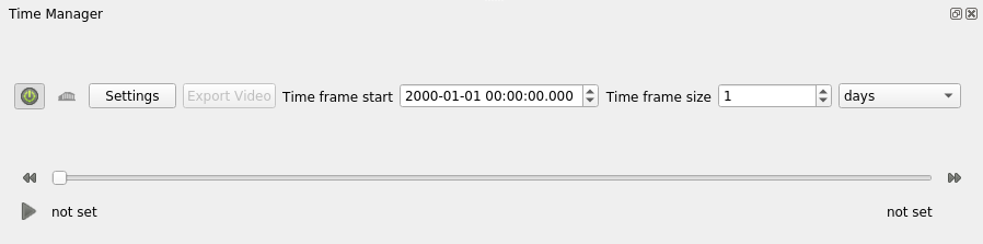
Make sure that the “Time frame size” is set to “1 days”.
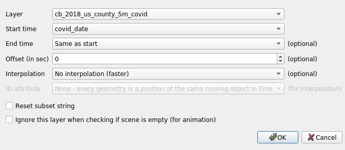
Click the “Settings” button to open the TimeManager settings window,
then select the “Add layer” button. In the resulting window, select
the cb_2018_us_county_5m_covid layer in the “Layer” menu, the select
the covid_date column in the “Start time” menu. Leave all other
values at their defaults and click “OK” to return to the TimeManager
settings.
You will see the layer we just added listed in the “Layers” list. Look
for the “Time Format” column in this list, which will say “TO BE
INFERRED”. Click in this column and change the value to %Y-%m-%d to
match the format of the dates in the covid_date field.
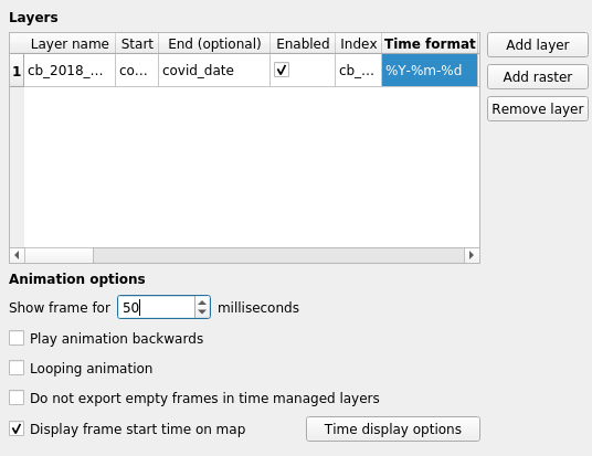
You may want to change “Show frame for” setting from the default to something like 50 milliseconds. Leave everything else at the defaults and click the “OK” button.
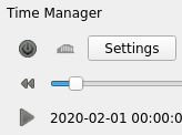
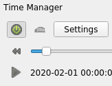
Ensure that the TimeManager is enabled by clicking on the “power button” in the TimeManager panel. TimeManager is enabled when the power button is green.
Disabled:
Enabled:
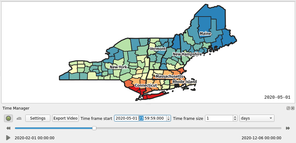
Once TimeManager is enabled, you should be able to use the slider to view the map at different times. For example, here’s the map in early May:
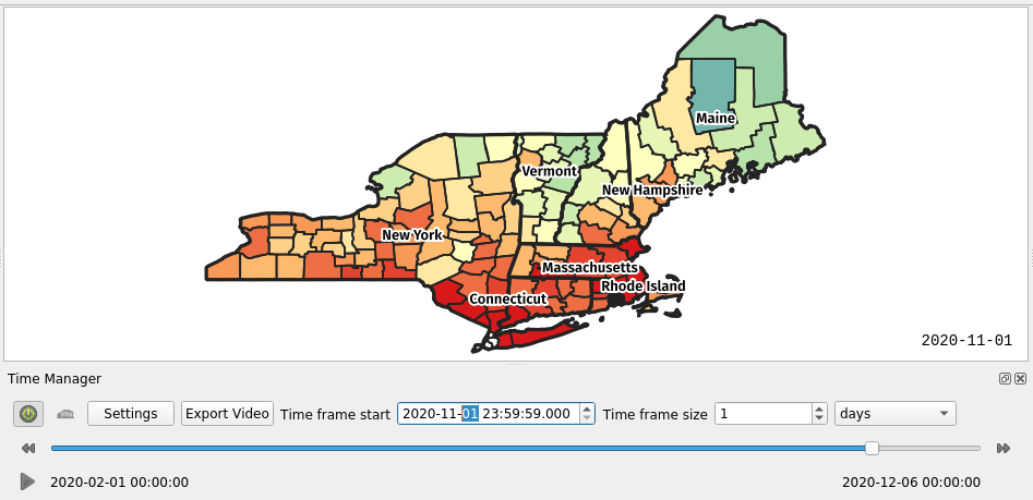
And here it is in early November:
To animate the map, click the play button in the bottom left of the TimeManager panel.
You can export the animation to a video using the “Export Video”
button. Assuming that you have ffmpeg installed, you can select an
output directory, select the “Video (required ffmpeg …)” button,
then click “OK”. You’ll end up with (a) a PNG format image file for
each frame and (b) a file named out.mp4 containing the exported
video.
Datasets#
I have made all the data referenced in this post available at https://github.com/larsks/ne-covid-map.